Beatrix Antiqua
Zetafonts · Francesco Canovaro with Cosimo Lorenzo Pancini and Andrea Tartarelli · 2016
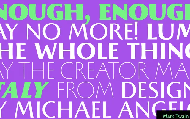
A humanist sans whose capitals are drawn from stone carvings in Florence's Santa Croce Cathedral, retaining variable stroke widths and subtle terminal swellings without full serifs.
About
Capitals derived from Florentine monumental inscriptions give the letterforms a glyphic quality reminiscent of Hermann Zapf's Optima, with strokes that taper towards terminals rather than sitting uniformly weighted. The lowercase carries early humanist calligraphic details, most visible in the italics, including a prolonged e nose. Eighteen styles run from Thin to Extrablack with matching italics, and the family covers Latin, Greek and Cyrillic across 196 languages.
Classification
A humanist sans-serif with variable-width strokes and subtle terminal swelling derived from Roman monumental capitals, placing it in the glyphic or incised tradition akin to Optima rather than a pure grotesque or humanist sans.