Berton Voyage
Zetafonts · Matteo Berton, Cosimo Lorenzo Pancini · 2017
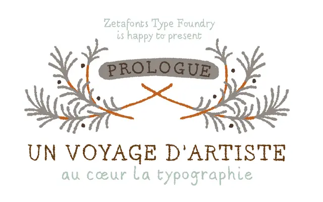
A hand-drawn display typeface created by illustrator Matteo Berton for the graphic novel adaptation of Jules Verne's 'Voyage au Centre de la Terre', digitised by Zetafonts with randomised glyph sets to simulate natural handwriting.
About
Originally lettered by Italian illustrator Matteo Berton for La Pasteque's illustrated retelling of the Verne classic, the typeface takes Didot proportions and roughens them with chalky, handmade textures suited to captions and small running text. Three alternate glyph sets rotate via OpenType ligatures to break the mechanical repetition typical of digitised handwriting. Available in two weights with coverage across 190 languages in Latin and basic Cyrillic.
Classification
Originally hand-drawn by illustrator Matteo Berton for a graphic novel, the typeface uses Didot proportions with chalky, rough handmade textures and randomised glyph sets, placing it firmly in the display/handwritten category rather than conventional serif or script.