Blacker Pro
Zetafonts · Cosimo Lorenzo Pancini, Andrea Tartarelli · 2018
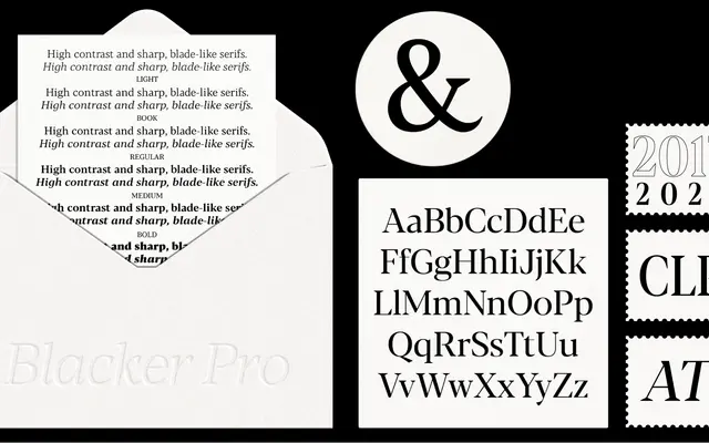
A Didone-influenced editorial serif with three optical subfamilies, nine width and size variants, and variable font support across 221 languages.
About
Designed by Cosimo Lorenzo Pancini and Andrea Tartarelli, Blacker Pro pairs wedge-shaped serifs with pronounced Didone stroke contrast across Text, Subhead and Display optical sizes, each available in standard, Narrow and Condensed widths. A weight range from Light to Fat, plus a 2024-introduced Subhead subfamily bridging the contrast gap between Text and Display, gives the family unusual coverage for editorial and advertising work. Variable fonts with weight and optical size axes are included in the full family package.
Classification
Blacker Pro draws explicitly on Didone contrast with wedge-shaped serifs and high stroke variation across optical sizes, placing it firmly in the modern serif / Didone tradition rather than transitional or humanist categories.