Blackest
Zetafonts · Francesco Canovaro, Andrea Tartarelli · 2018
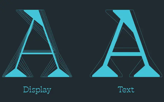
A reverse-contrast wedge serif derived from Cosimo Lorenzo Pancini's Blacker, inverting the stroke modulation to produce a quirky yet classical display family.
About
Built on the skeleton of Blacker, this family flips conventional contrast so horizontal strokes outweigh verticals, placing it in the tradition of so-called Italian or reverse-contrast typefaces. Six display weights from Light to Heavy suit editorial, poster and identity work, while a two-weight Text variant offers reduced contrast and looser spacing for longer-form setting. The character set covers over 220 Latin-based languages and Russian Cyrillic, with OpenType features including small caps, stylistic alternates, old-style figures and discretionary ligatures.
Classification
Blackest is an inverse contrast (Italian-style) wedge serif, where horizontal strokes are heavier than verticals, inverting the typical modulation of classical serifs. It derives from Blacker, a wedge serif, but shifts the contrast axis entirely.