Body
Zetafonts · Cosimo Lorenzo Pancini, Andrea Tartarelli · 2018
A 64-style grotesque superfamily in two variants — Text and Grotesque — each offered across four widths and four weights, designed as a contemporary alternative to Univers or Helvetica.
About
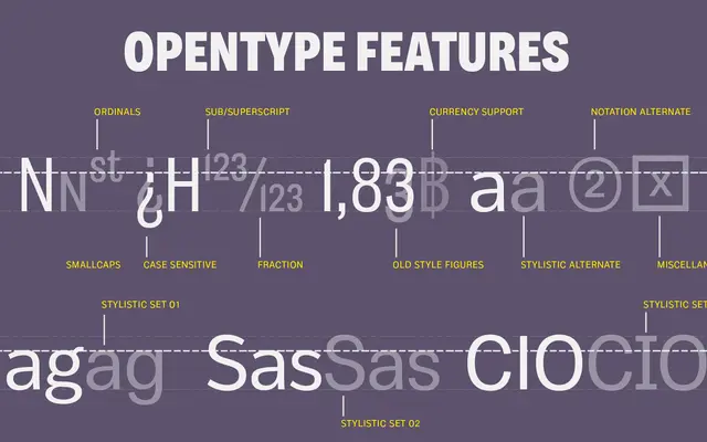
Body Text prioritises legibility through open terminals and strong horizontal strokes, countering the darkness typical of modernist grotesques. Body Grotesque takes a different path, introducing subtly calligraphic curves and a light inverse contrast at bold weights that gives display sizes a faint vintage character. Both subfamilies cover 204 languages via Latin Extended and Russian Cyrillic, with small caps, oldstyle figures and multiple OpenType features throughout.
Classification
Body is a modernist grotesque superfamily with two distinct subfamilies: Body Grotesque, which introduces calligraphic quirks and inverse contrast drawn from early 20th-century specimens, and Body Text, which prioritises readability through open terminals and maximised horizontal strokes.