Byom
Zetafonts · Francesco Canovaro · 2016
sans-serifgeometric sans
A round geometric sans in four weights by Francesco Canovaro, released in 2016 and bundled with a pixel-perfect icon set for screen use.
About
Built on circular, natural forms, the family aims for clarity and visual balance across web, app and print contexts. Four weights run from Thin to Bold, supported by broad Latin coverage across 202 languages with a full diacritic set. An accompanying icon set is optimised for 16px and its multiples, making the family well suited to UI work.
Classification
Byom is built on round, natural shapes with a geometric sensibility, placing it squarely in the geometric sans category. Its emphasis on purity and circular forms is consistent with contemporary geometric sans-serif design.
Weights
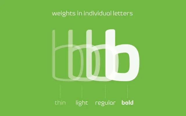
ThinLightRegularBold
Languages
Latin
Tags
geometricroundscreenappwebcleaniconslatin-extended