Coco Gothic
Zetafonts · Cosimo Lorenzo Pancini · 2015
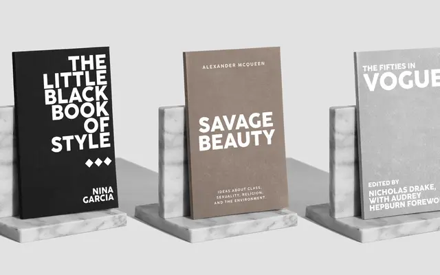
A geometric sans by Cosimo Lorenzo Pancini referencing early twentieth-century typefaces such as Futura, with slight corner rounding meant to evoke the warmth of letterpress ink spread.
About
Designed in response to a biography of Coco Chanel, the typeface pairs geometric sans structure with humanist proportional adjustments and subtly rounded corners to recall the softening effect of ink on paper. The Pro revision, released six years after the original, expands the family to three subfamilies — standard, Alternate and Display — each in seven weights with matching italics and variable font versions. Ten alternate historical sets covering styles from art deco to 1980s minimalism are accessible via OpenType, and the full family supports 216 languages across Latin, Greek and Cyrillic.
Classification
Draws directly from early geometric sans models such as Futura and Berthold Grotesque, with slight corner rounding and humanist proportional touches that soften the pure geometric framework.