Crescendo
Zetafonts · Cosimo Lorenzo Pancini · 2026
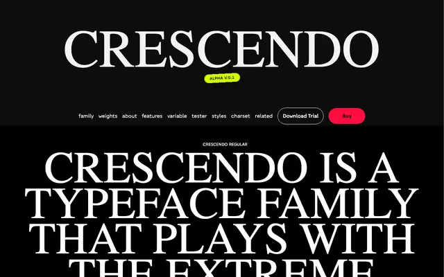
A condensed geometric sans by Cosimo Lorenzo Pancini drawing on Art Deco proportions and 1970s decorative sans traditions, designed as the serif-free counterpart to Ouverture.
About
Built around a condensed structure with sharply modulated geometry, Crescendo references the decorative sans serifs of the 1970s and the lettering sensibility of Herb Lubalin. The family spans three optical sizes — Display, Standard and Text — each in five weights from Light to Black, with a variable font available in the full package. Its 688-glyph set covers 200 languages and includes small capitals, oldstyle figures, fractions and stylistic alternates.
Classification
A condensed geometric sans with Art Deco proportions and extreme contrast between round and upright letterforms, placing it firmly in the geometric sans tradition with display-oriented sensibility.