Delizioso
Zetafonts · Francesco Canovaro · 2008
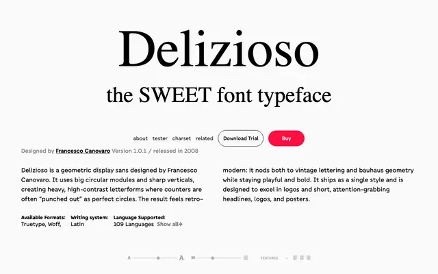
A single-style geometric display sans by Francesco Canovaro built on circular counters and sharp verticals for use in logos and short headlines.
About
Released in 2008, it uses large circular modules punched into heavy letterforms to create high-contrast capitals with a retro-modern character that references both vintage lettering and Bauhaus geometry. The design ships as one style only, with no italic or weight variants, making it a focused tool for posters, logotypes and short display copy. Its 225-glyph character set covers 109 languages across Latin-script European writing systems.
Classification
A single-weight display sans built from circular modules and sharp verticals with high contrast, intended solely for headlines and logos rather than text setting, placing it firmly in the display category with a geometric construction approach.