Domotika Pro
Zetafonts · Cosimo Lorenzo Pancini, Andrea Tartarelli · 2018
A humanist sans with calligraphic curve endings and semi-condensed proportions, designed for editorial and display work across Latin, Greek and Cyrillic scripts.
About
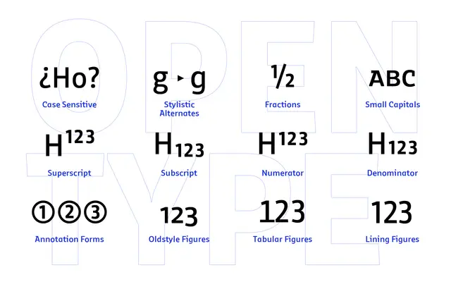
Originally designed by Cosimo Lorenzo Pancini in 2018, the family was substantially expanded in 2021 by Andrea Tartarelli, who reworked the italics and added over 500 glyphs to extend coverage to 219 languages across three scripts. Open humanist letterforms are tempered by slight calligraphic curve endings, lending the typeface personality without sacrificing legibility. Sixteen styles from Thin to Black with matching italics, plus a broad OpenType feature set including small caps, oldstyle figures and stylistic sets, make it a practical choice for text and display settings alike.
Classification
Domotika combines open humanist letterforms with slight calligraphic curve endings, placing it firmly in the humanist sans tradition. Its semi-condensed proportions and architectural pragmatism distinguish it from geometric or grotesque models.