DoubleBass
Zetafonts · Cosimo Lorenzo Pancini · 2018
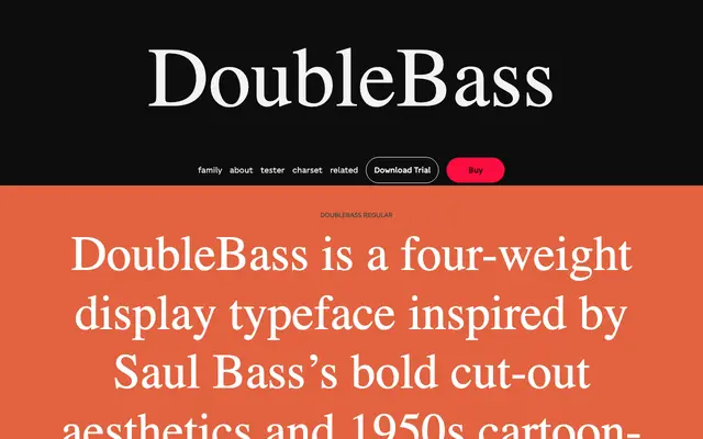
A four-weight display family by Cosimo Lorenzo Pancini drawing on Saul Bass's cut-out lettering and 1950s cartoon-modern graphics, using OpenType alternating capitals to produce a natural bouncing rhythm without extensive ligature sets.
About
Designed in homage to Saul Bass's title sequence work and the jazzy graphics of the mid-twentieth century, the family uses a modular structure in which two alternating sets of capitals and numbers are substituted automatically via OpenType, producing a lively up-down rhythm as you type. Four weights run from Thin through to Bold, with lighter cuts serviceable for short text blocks and heavier weights suited to logotypes and headlines. Latin and Cyrillic writing systems are covered across 198 languages and 432 glyphs per style.
Classification
Explicitly created as a display typeface drawing on 1950s cartoon-modern lettering and Saul Bass's cut-out hand lettering style; its modular, alternating-cap structure is purely display-oriented.