Erotique Sans
Zetafonts · Cosimo Lorenzo Pancini, Maria Chiara Fantini, Solenn Bordeau · 2020
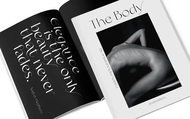
A high-contrast sans with Didone-like stroke modulation, designed for display and titling work where restrained elegance and an edgy contemporary character are needed.
About
Designed by Cosimo Lorenzo Pancini and Maria Chiara Fantini, Erotique Sans strips the serifs from the Erotique family whilst retaining its didonesque contrast and assertively feminine character. The family spans four weights with matching Alternate cuts providing access to exotic letterforms, a Flourishes set of whiplike fleurons for logo and titling work, and a dedicated Text Regular with reduced contrast for longer-form use. Over 565 glyphs cover 190 languages in extended Latin, with OpenType support for stylistic alternates, ligatures, swash forms and multiple numeral styles.
Classification
A serif-free, high-contrast sans with Didone-influenced stroke modulation, designed explicitly for display and titling use rather than text setting. Its dramatic thick-thin contrast and romantic curves place it firmly in the display category.