Freitag
Zetafonts · Cosimo Lorenzo Pancini · 2022
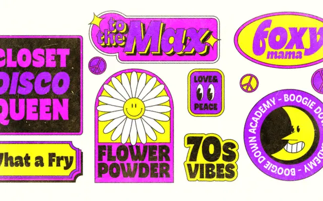
A 1970s-inflected display sans by Cosimo Lorenzo Pancini, built on reverse contrast and flared stems that escalate into full bell-bottom exuberance at heavier weights.
About
Freitag draws on the buoyant photo-lettering and rub-on transfer typography of the 1970s, referencing designers such as Benguiat, Novarese, Motter and Excoffon. The Roman subfamily progresses from a controlled medium-contrast Light through to a Heavy where reverse contrast becomes unmistakable, while the Display subfamily pushes further still with swash capitals, connected italics and optical sizing marked as M, L and XL. The full family ships as 16 static styles plus four variable fonts covering weight and contrast axes, with 587 glyphs supporting 205 languages across extended Latin.
Classification
A heavy sans serif with humanist condensed proportions, flared stems and reverse contrast, drawing on 1970s photo-lettering and display typography traditions rather than text use.