Groot
Zetafonts · Cosimo Lorenzo Pancini · 2024
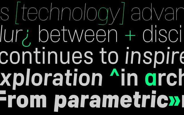
A variable industrial grotesque by Cosimo Lorenzo Pancini that uses a curvature axis to shift between utilitarian body text and expressive display settings.
About
Designed at Zetafonts by Cosimo Lorenzo Pancini with Mario De Libero and Nicolas Sendre Billout, Groot takes DIN-like proportions as its base and introduces a variable axis controlling the superness of inner-counter curvature. The Bau subfamily pushes this to its limits, producing overlapping counters in thin weights and squared counterspaces in heavy ones, creating a noticeably contrasted result. Brutalist uppercase alternates and six stylistic sets give the family range from transparent body text to logotype and editorial work, with 20 static styles and two variable font files across the full package.
Classification
Groot is firmly in the industrial grotesque tradition, drawing on DIN-like proportions while introducing a variable curvature axis and brutalist uppercase alternates that push it towards constructed, mechanical expressiveness.