Heading Pro
Zetafonts · Francesco Canovaro, Andrea Tartarelli, Cosimo Lorenzo Pancini, Chiara Ghezzi · 2017
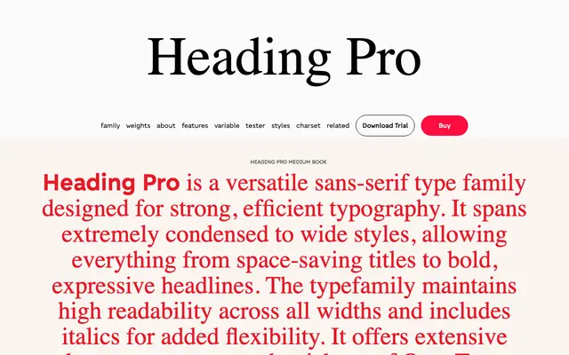
A large sans-serif system spanning eight widths and nine weights, built for space-optimised titling and expressive headline work.
About
Originally designed by Francesco Canovaro and expanded by the Zetafonts team into 146 variants, the family runs from Ultra Compressed to Ultra Wide with nine weights at each width. The condensed cuts suit credit lists and timetables where space is tight, while the wide cuts trade economy for raw presence in headlines. Each style covers Latin, Cyrillic and Greek across 218 languages, and includes small caps, old-style figures and stylistic alternates; variable font versions are available with weight and width axes.
Classification
A geometric-leaning sans-serif with post-modernist attention to detail, designed primarily for display and titling use across an unusually wide range of widths from ultra-compressed to ultra-wide.