Holden
Zetafonts · Cosimo Lorenzo Pancini, Andrea Tartarelli · 2018
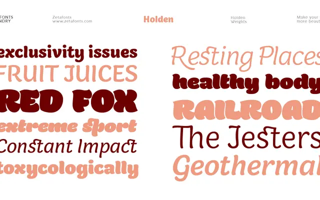
A six-weight Latin serif with pointed brush roots and high stroke contrast, designed to span text and display use within a single family.
About
Designed by Cosimo Lorenzo Pancini and Andrea Tartarelli, Holden runs from a lightly contrasted Light through to a fluid, tight-countered Fat, with matching italics across all six weights. The curvy, brush-influenced letterforms hold up in running text at the lighter end and deliver expressive results at display sizes as the weight increases. Each font includes a thorough set of OpenType features: small caps, stylistic alternates, swash italics, old-style figures and a set of decorative manicules and fleurons.
Classification
Holden draws on pointed brush aesthetics with high stroke contrast and curvy, calligraphic forms across an extreme weight range, placing it firmly in the contrasted serif tradition with a contemporary editorial sensibility.