Keratine
Zetafonts · Cosimo Lorenzo Pancini · 2022
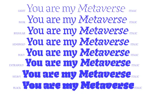
A hybrid of Fraktur and Humanist antiqua filtered through low-resolution digital aesthetics, designed by Cosimo Lorenzo Pancini and released in 2022.
About
Drawing on the obscure historical middleground between blackletter and Roman type — exemplified by the Pannartz-Sweynheym Subiaco types of 1462 — Keratine applies a quasi-pixelated, digitally carved treatment to letterforms that carry both Fraktur energy and Humanist proportion. Eight weights with matching italics allow the family to move from a contrasted, text-oriented light end to a more expressive display range, with a variable font axis reinforcing that spectrum. OpenType alternates including Gothic letterforms, single-storey variants and medieval forms extend its expressive range considerably. Awarded by both the Type Directors Club and Communication Arts in 2023.
Classification
Keratine sits at the intersection of Fraktur and Humanist antiqua traditions, filtered through a quasi-pixelated, digitally carved aesthetic. Its blackletter classification reflects the Fraktur gestural energy and Gothic letterforms at its core, even as it borrows humanistic proportions.