Mezura
Zetafonts · Cosimo Lorenzo Pancini · 2023
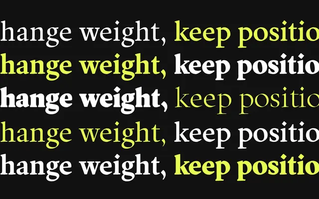
A bilingual Arabic and Latin typeface by Cosimo Lorenzo Pancini that uses a mono-width approach derived from Naskh calligraphy and Old Style proportions, keeping character widths constant across seven weights.
About
Unusually, the design began with Arabic Naskh rather than Latin, with the Latin letters subsequently drawn to echo their Arabic counterparts. The mono-width constraint means each letter occupies the same horizontal space regardless of weight, producing a distinctive compressed density in the heavier cuts that mirrors how Arabic letterforms thicken in manuscript traditions. Light and Fat weights are tuned for display use while the Regular maximises on-screen and print readability with open counters.
Classification
Mezura draws on the circular proportions of Naskh calligraphy and Old Style Latin forms, blending geometric structure with calligraphic movement across both Arabic and Latin scripts. The mono-width approach and display-oriented extremes place it within a geometric humanist tradition.