Mira Confundo
Zetafonts · Cosimo Lorenzo Pancini · 2025
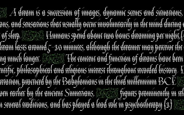
A display typeface derived from folio 96 of Georg Bocksay's Mira Calligraphiae Monumenta, where diagonal fractures in the vertical strokes produce a saw-tooth rhythm that cuts across the Gothic flow.
About
Cosimo Lorenzo Pancini's study of Bocksay's 16th-century calligraphic model book resulted in a letterform system that fuses Roman capital proportions, textura-based lowercase structure and chancery cursive fluency into a single cohesive voice. The defining feature is the diagonal incision through vertical strokes, a device Pancini identified in a single folio that gives the typeface its oscillating visual pulse. With 346 glyphs, alternate uppercase and lowercase forms, lining and oldstyle figures, and decorative fleurons, the family is suited to editorial headlines, book covers and typographic poetry where historical strangeness is the point.
Classification
Mira Confundo fuses textura blackletter modularity with chancery cursive and Roman capitals, making blackletter the dominant structural reference, though its hybridity and display intent set it apart from conventional Gothic classifications.