Napo
Zetafonts · Isabella Ahmadzadeh · 2016
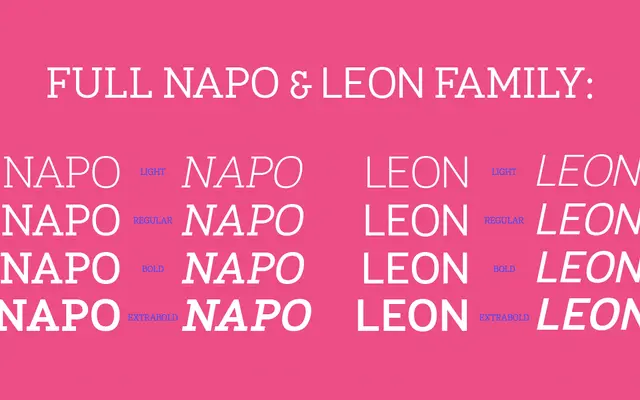
A slab serif by Isabella Ahmadzadeh designed for both display and body copy, offered in four weights with italics and broad Latin language coverage.
About
Released in 2016, Napo spans four weights from Light to Extrabold, each with a matching italic, covering 188 languages across the Latin script. It is paired with Leon, a companion sans-serif that shares the same weight range and proportions, giving designers a matched serif and sans within a single purchase. The family is suited to editorial and branding projects that require a slab with reasonable typographic range.
Classification
Napo is explicitly described as a slab serif, designed for both display and body copy use, with sturdy bracketed serifs characteristic of the genre.