Noctis
Zetafonts · Luca Terzo, Cosimo Lorenzo Pancini, Valentino Coppi · 2020
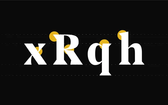
A high-contrast didone with sharp triangular serifs, drawn from Novarese's Primate and pitched at fashion editorial and identity work.
About
Designed by Luca Terzo and developed by the Zetafonts team, Noctis runs across five weights from Thin to Heavy, each with a true italic, totalling ten upright and italic styles. The family extends into a Texturae subfamily where individual letterforms tile into seamless decorative patterns for branding use. Didonesque contrast and distinctive wedge serifs give it presence at display sizes without entirely sacrificing text legibility, and 481 glyphs cover 197 Latin-script languages.
Classification
Strong vertical contrast and triangular wedge serifs place Noctis firmly in the Didone tradition, drawing direct inspiration from Aldo Novarese's Primate (1972) while adding sharp, fashion-inflected detailing.