Ouverture
Zetafonts · Cosimo Lorenzo Pancini, Andrea Tartarelli · 2024
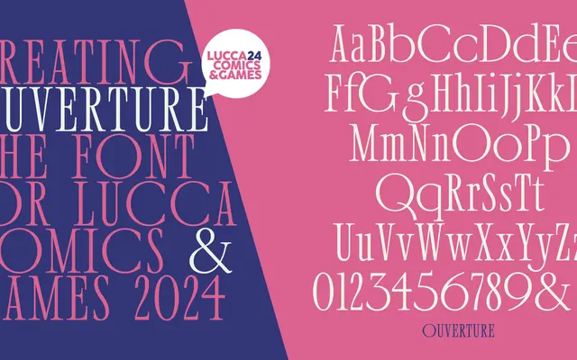
A condensed Didone designed for Lucca Comics & Games 2024, drawing on late-90s anime and gaming aesthetics to reframe classical high-contrast serif forms with a retro-futuristic character.
About
Designed by Cosimo Lorenzo Pancini with Andrea Tartarelli, the family spans four optical subfamilies — Text, Deck, Display and Grande — each tuned for different scales and media. The ultra-compressed proportions and sharp contrast of the display cuts give way to more refined, readable forms at text sizes, while details echo University Roman's idiosyncratic playfulness. The family has a sans-serif counterpart, Crescendo, which translates the same retro-futuristic energy into geometric, Art Deco-inflected forms.
Classification
A condensed Didone with high contrast and ultra-compressed proportions across optical sizes, drawing on classical modern serif tradition while incorporating idiosyncratic details reminiscent of University Roman.