Panforte
Zetafonts · Debora Manetti · 2013
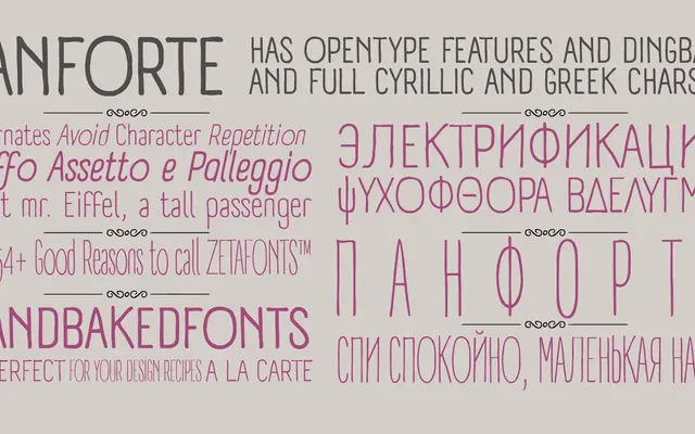
A very condensed sans-serif by Debora Manetti, drawn with loose hand-influenced strokes and optimised for readable text setting across over 200 languages.
About
Designed by Debora Manetti and released in 2013, Panforte is a condensed sans-serif built around big, freely drawn strokes that give it an organic quality while keeping text legible at tight column widths. The family covers 772 glyphs across Latin, Greek and Cyrillic scripts, with OpenType features including small capitals, oldstyle numerals, repeating-letter ligatures and arrow ligatures. Three weights with matching italics make it serviceable for editorial and branding work where space is limited.
Classification
A very condensed sans-serif drawn with hand-influenced strokes, intended for readable text setting at narrow widths across Latin, Greek and Cyrillic scripts.