Quenta
Zetafonts · Francesco Canovaro, Debora Manetti · 2022
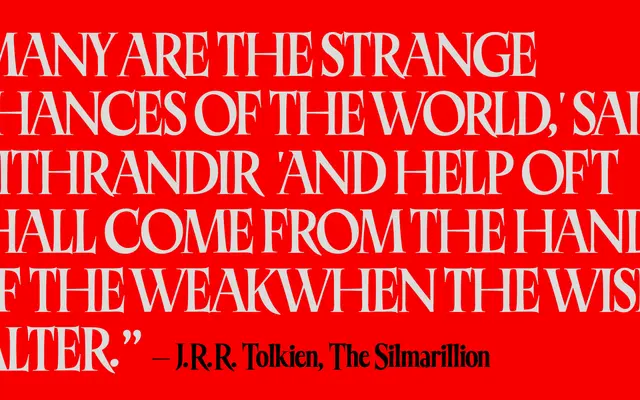
A condensed display serif in four layered styles, drawn from early twentieth-century Australian showcard lettering and the handlettered masthead of the Queensland weekly magazine.
About
Designed by Francesco Canovaro with Debora Manetti and released in 2022 as part of the Singularities set, Quenta takes its proportions and decorative sensibility from the handlettered masthead of Queenslander magazine and the showcard manuals of penmasters such as Ross F. George and Samuel Weld. The four styles — Regular, Headline, Shadowed and Layer Shadow — are designed to stack as colour-font layers, reproducing the highlight effects typical of mid-century advertising lettering. Discretionary ligatures introduce script elements that extend the family's range for editorial headers and logo work.
Classification
A condensed serif display face with layered shadow styles derived from early twentieth-century showcard lettering traditions; the multiple colour-font layers and decorative register place it firmly in the display category rather than text.