Quieta
Zetafonts · Maria Chiara Fantini · 2019
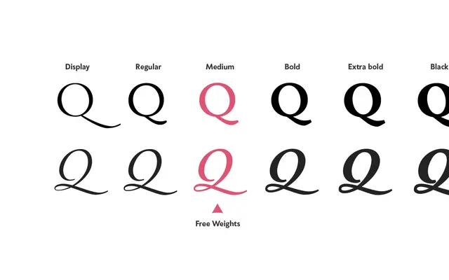
A humanist serif by Maria Chiara Fantini drawing on Italian Renaissance calligraphy and the history of painter Artemisia Gentileschi, spanning six weights with a dedicated Display cut.
About
Flat-nib calligraphic strokes give the letterforms a lively rhythm while keeping contrast low enough for extended text reading, both on screen and in print. Classical details including the beaked 'e' and angled stress of the 'o' sit alongside a wide set of swash, alternate and decorative glyphs for expressive typesetting. A lighter, higher-contrast Display weight handles logos and headlines, and the family covers over 214 Latin languages across 641 glyphs.
Classification
Classified as humanist serif; draws on Italian Renaissance calligraphic tradition with flat-nib stroke construction, angled stress and classical details such as the beaked 'e', balanced by low contrast for text use.