Stinger
Zetafonts · Cosimo Lorenzo Pancini, Maria Chiara Fantini, Andrea Tartarelli · 2020
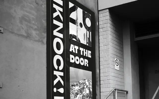
A reverse-contrast super-family of 40 styles across four widths and five weights, rooted in 19th-century Italian type specimens and cross-bred with the systematic rigour of modernist grotesques.
About
Stinger takes the reverse-contrast tradition that dates to William Caslon's 1821 specimens and applies it to a Univers-style grid of four widths (Slim, Normal, Fit and Wide) plus a Text subfamily, each running from Thin to Heavy with true italics. The result is 40 fonts covering 218 languages across Latin extended, Cyrillic and Arabic, with two variable fonts providing continuous control over both weight and width axes. Calligraphic terminals in the lighter weights give way to sculptural, logo-ready forms in the heaviest cuts, keeping personality consistent across the range.
Classification
Stinger uses reverse contrast throughout, subverting the conventional thick-vertical/thin-horizontal relationship. The design draws on the tradition of 19th-century Italian reverse-contrast types while applying the systematic width and weight grid of modernist grotesques like Univers.