Sugo
Zetafonts · Francesco Canovaro, Andrea Tartarelli · 2006
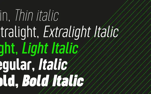
A condensed geometric sans originally designed as a logo typeface in 2006, fully redesigned in 2018 with expanded language support, italics and a companion Display subfamily.
About
Originally drawn by Francesco Canovaro in 2006, Sugo is a condensed geometric sans with slightly rounded corners built for logo and branding work. Andrea Tartarelli undertook a complete redesign in 2018, adding three extra weights, italics, Cyrillic and Greek, small caps and full OpenType features. The family splits into Sugo Pro Classic for general and body use and Sugo Pro Display, which uses alternate glyphs and tighter kerning suited to titling and identity work.
Classification
A condensed geometric sans-serif with slightly rounded corners, originating as a logo typeface and expanded into a full family. The geometric construction and tight proportions place it firmly in the geometric sans category.