Tarisel
Zetafonts · Martin Brendecke · 2026
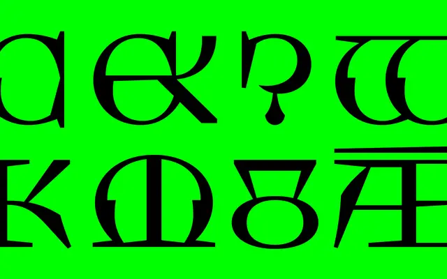
A Lombardic capitals display family by Martin Brendecke, drawn from 13th-century inscriptions at Amiens Cathedral and extended into two distinct subfamilies with variable weight axes.
About
Built entirely from Lombardic capitals, Tarisel takes its structural cues from medieval stonecutting at Amiens, then pushes the forms into contemporary display territory through elongated serifs and broken counterforms. The family splits into two branches: the Roman subfamily echoes Romanesque calligraphic origins, while Tarisel Gothic emphasises angular, compressed rhythm; multiple stylistic sets let the two lineages be mixed to produce hybrid settings. Ten static styles run from Light to Black across both subfamilies, with variable weight axes available as part of the full package, and the family was selected by the Type Directors Club in 2026.
Classification
Tarisel is a capitals-only display face rooted in Lombardic letterforms drawn from 13th-century Romanesque and Gothic inscriptions, with ornamental structural details that place it firmly in the display/decorative category rather than a conventional blackletter or serif classification.