Television
Zetafonts · Francesco Canovaro, Cosimo Lorenzo Pancini, Mario De Libero · 2025
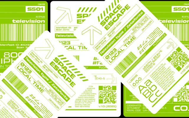
An 84-style industrial grotesque spanning Condensed to Ultrawide, designed by Canovaro and Pancini as a futuristic extension of the Eurostile and Microgramma tradition.
About
Built on the modular, low-contrast skeleton of Aldo Novarese's Eurostile and Microgramma, Television stretches that visual logic across six width axes from Condensed to Ultrawide, each in seven weights with matching italics. Open-ended terminals and expanded geometric apertures replace tightly engineered solidity, giving the family a sense of forward motion suited to screen interfaces, titling and wide-format compositions. Accentuated ink traps sharpen performance at smaller sizes, and a variable font with weight, width and italic axes ships with the full family package.
Classification
Explicitly described as a contemporary industrial grotesque, drawing on the geometric modular construction of Eurostile and Microgramma with low contrast, utilitarian sharpness and accentuated ink traps.