Thicker Narrows
Zetafonts · Francesco Canovaro, Andrea Tartarelli · 2025
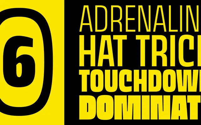
A condensed and compressed extension of the Thicker display family, built for sports communication and advertising with squared geometric forms drawn from Eurostile-era aesthetics.
About
Thicker Narrows brings two narrow widths, Condensed and Compressed, to Francesco Canovaro and Andrea Tartarelli's muscular display sans, each spanning ten weights from Thin to Extrablack. The squared contours carry a retro-futurist flavour that nods to Novarese's Eurostile, sitting naturally in sports branding, poster work and logo design. Over 1,024 glyphs cover Latin, Greek and Cyrillic across 218 languages, with OpenType features including small caps, positional numerals and case-sensitive forms.
Classification
A condensed and compressed extension of the Thicker sports display sans, with squared geometric contours influenced by Eurostile-era space-age aesthetics, intended primarily for high-impact display and advertising use.