UX Sans
Zetafonts · Francesco Canovaro · 2023
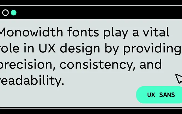
A geometric sans designed specifically for web interfaces, built around a monowidth proportion system that keeps character widths consistent across all seven weights.
About
Designed by Francesco Canovaro from two decades of UX and interface design practice, UX Sans prioritises legibility at every weight through wide proportions, generous spacing and disambiguation details such as a tailed lowercase 'l' and serif uppercase 'I'. The monowidth system means changing text weight on rollover does not disrupt layout, a practical concern central to the design. The family spans 42 styles across Roman, Stereo and Mono subfamilies, with a variable font and a built-in icon set for visual consistency across platforms.
Classification
UX Sans is explicitly described as a geometric sans serif, with wide open proportions and a monowidth system across all weights, characteristic of geometric sans design applied to interface contexts.