Visconte
Zetafonts · Andrea Tartarelli · 2023
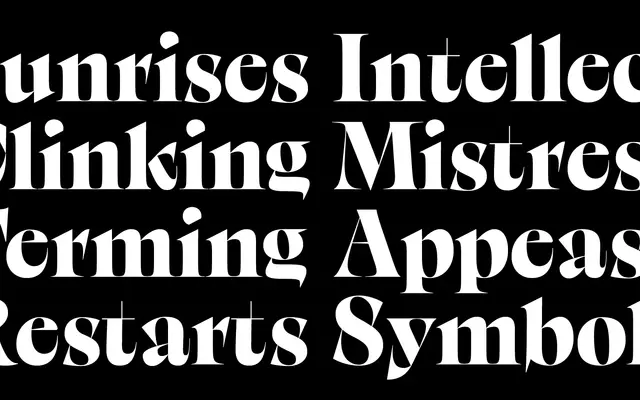
A self-described 'brutal serif' by Andrea Tartarelli, built on an old-style calligraphic skeleton and distorted into spiky, high-contrast forms inspired by Italo Calvino's The Cloven Viscount.
About
Designed as the signature typeface for the Desina Graphic Design Festival 2023, Visconte extends Zetafonts' Calvino family by pushing the contrast axis far beyond the Grande subfamily, introducing deliberate distortions and unexpected stroke connections. The family comprises two subfamilies, Visconte and Visconte Reale, each available in four weights from Regular to Black, plus a variable font. Its raw, spiky serifs and medievalised texture suit editorial headlines, posters and book covers where high tension between elegance and rupture is the point.
Classification
Described explicitly as a 'brutal serif', Visconte builds on an old-style calligraphic structure but pushes contrast and distortion to extremes, making it unsuitable for text use and firmly a display typeface.