Priori Sans
Barnbrook · Jonathan Barnbrook
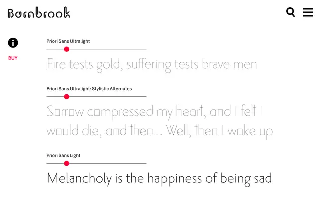
A sans-serif text face designed alongside a serif counterpart, both sharing a common core character structure rooted in early 20th-century London typography.
About
Part of the Priori system, which proposes that serif and sans-serif variants share a common underlying character shape so they can be mixed within the same word or setting. Barnbrook drew directly from the early 20th-century typographic culture of London, giving the Sans a grounded, place-specific quality rather than a neutral or abstract one. The paired-family approach makes it suited to editorial and book work where serif and sans need to coexist without visual friction.
Classification
Priori Sans draws on early 20th-century London typography, giving it the humanist warmth and historical grounding typical of humanist sans-serifs rather than the neutrality of grotesque or geometric approaches.