Priori Serif
Barnbrook · Jonathan Barnbrook
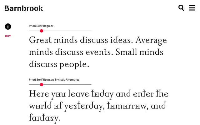
A text serif rooted in early 20th-century British letterform tradition, designed to mix with its sans-serif counterpart within the same word.
About
Part of the Priori family, which pairs a serif and a sans sharing a common underlying structure so they can be set together without friction. The design draws on Eric Gill and Edward Johnston's work in London, treating their calligraphic and inscriptional models as a starting point before introducing experimental characters that push those traditional forms. Ultra-lightweight cuts are included for signage and large-scale display use.
Classification
Priori Serif draws from early 20th-century British typography, particularly Eric Gill and Edward Johnston, giving it a humanist character rooted in calligraphic and inscriptional traditions, with experimental letterform details layered over that classical base.