Nitti Grotesk
Bold Monday · Pieter van Rosmalen · 2012
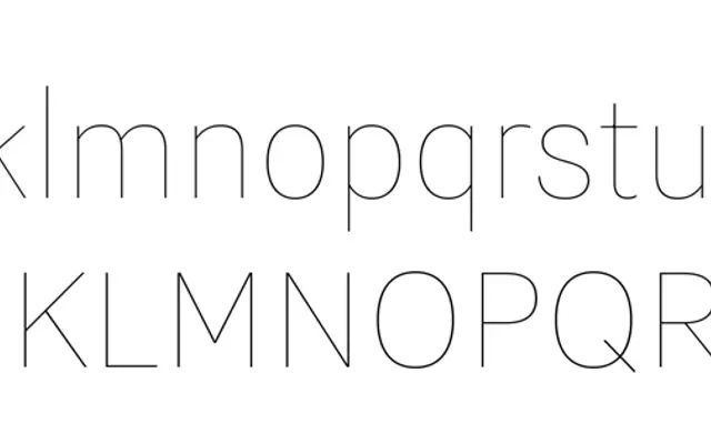
A proportional grotesque by Pieter van Rosmalen, grown from the same lineage as the monospaced Nitti and drawing on the idiosyncratic quirks of early English sans-serifs.
About
Born from a request by Information Architects for a proportional companion to Nitti, the family took three attempts before van Rosmalen settled on pushing the design further into grotesque territory where Nitti had strayed from convention. Seven text weights with italics sit alongside five display-only weights, with a condensed sibling available for headline use. The extended Latin coverage and range of OpenType features make it a thorough workhorse for editorial and identity work.
Classification
Directly descended from early English grotesque sans-serifs, van Rosmalen leaned into the quirky, idiosyncratic letterforms of that tradition to give the proportional family warmth and humanity typical of the genre.