Dina Chaumont Display
b•v-h type · André Baldinger & Toan Vu-Huu · 2023
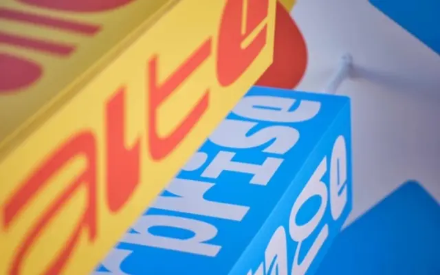
Commissioned for the visual identity of Chaumont, France, this lowercase-only monospace family is structured around the DIN A paper format, with letterforms designed to fill the page surface across both portrait and landscape orientations.
About
Designed by André Baldinger and Toan Vu-Huu, the Display family runs six weights from ExtraLight to Black, with the heaviest weight eliminating counterforms entirely to reduce letters to their most graphic state. The stems of lighter weights correspond in thickness to the counterforms of heavier ones, creating a deliberate visual logic across the range. A set of pictograms extends the glyph set beyond standard Latin coverage.
Classification
A lowercase-only monospace display face built around the DIN A paper ratio, with a highly structured, geometric construction. Its extreme weights and surface-filling letterforms place it firmly in the display category rather than functional text.