Dina Chaumont Text
b•v-h type · André Baldinger & Toan Vu-Huu · 2023
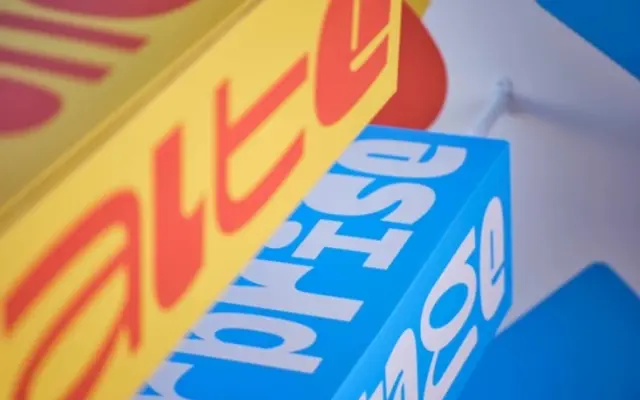
A text serif designed for the visual identity of Chaumont, France, drawing on Roger Excoffon's contrast arrangements to produce a lively, characterful type colour.
About
Commissioned for the city of Chaumont's new visual identity, the Text family pairs with a Display counterpart and is designed specifically for running text at small sizes, using a generous x-height to aid legibility. Its defining quality is an unconventional weight balance that shifts contrast to unexpected positions within letterforms, producing a sparkling, animated grey on the page. Design ideas are drawn from Roger Excoffon's approach to contrast, situating the family within a distinctly French typographic sensibility.
Classification
A text serif with contrast arrangement inspired by Roger Excoffon's work, featuring deliberate weight balance shifts that create a lively rhythm on the page; sits within a humanist serif tradition inflected by French typographic heritage.