Parabole
ECAL Typefaces · Dávid Molnár, Chandra Sperle · 2019
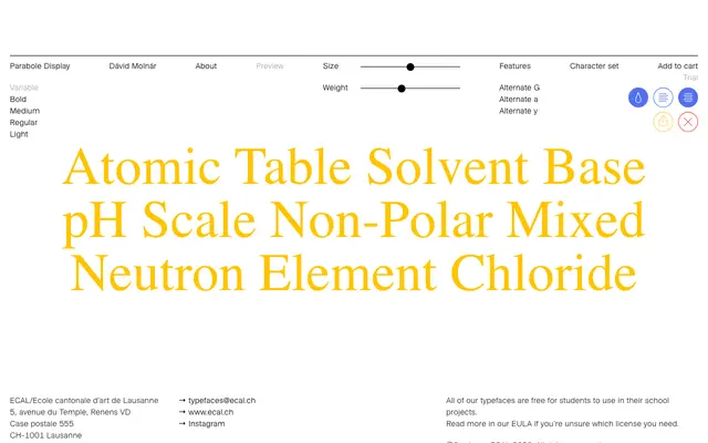
A two-cut typeface by Dávid Molnár in which the Display face is an inside-out inversion of its neo-grotesque Text companion, each letter traceable as a single continuous line.
About
The Display cut achieves its forms by flipping the counters and stems of the Text face, producing letters that read as a continuous line and take on a pixel-like quality at small sizes while appearing multilayered at larger settings. The Text cut is a straightforward neo-grotesque designed to pair with the Display either in combination or for extended passages. Originally designed in 2019, the family was expanded by Chandra Sperle in 2025.
Classification
The Display cut uses counter-and-stem inversion to produce a continuous-line, inside-out letterform with a pixel-like quality at small sizes; the Text cut is a neo-grotesque companion. The experimental construction of the Display face places the family firmly in the display category.