Chevin Pro
sans-serifhumanist sansitalic
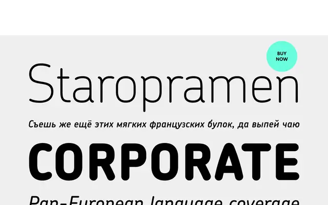
A rounded, slightly condensed humanist sans in six weights, best known as Royal Mail's corporate typeface since 2007.
About
Designed with open counters and a restrained construction, Chevin Pro is particularly well suited to signage and corporate identity work where legibility at small sizes matters. Erik Spiekermann has noted its balance of charm without cuteness. The Pro version extends beyond the standard Latin to cover Greek and Cyrillic scripts, with OpenType features including small caps, stylistic alternates and tabular figures.
Classification
Chevin is a rounded, slightly condensed sans-serif with open counters and restrained letterforms, placing it firmly in the humanist sans tradition with a functional, legibility-first approach.
Weights
LightRegularMediumDemiBoldExtra Bold
Family
Languages
LatinCyrillicGreek
Tags
roundedhumanistsignagecorporatelegiblebrandingslightly-condensed