Enra Semi
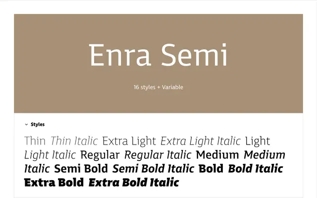
A semi-serif with top-only serifs that gives letterforms a forward-gliding quality, part of a three-sibling type system also including Enra Sans and Enra Slab.
About
The top-only serifs distinguish Enra Semi from its siblings by lending each letterform a sense of directional movement along the baseline. Designed around a large x-height, generous counters and open apertures, it holds up well at small sizes on screen and in print, with narrow proportions that conserve space without feeling tight. The family ships as 16 static styles plus a variable font, and includes a thorough OpenType feature set covering small caps, multiple numeral styles, circled figures via stylistic sets and full Vietnamese coverage.
Classification
Enra Semi is a hybrid sans that carries serifs only on the tops of letterforms, giving it a character distinct from both pure sans and full slab designs. This partial-serif approach places it in a semi-serif subcategory, combining the openness of a grotesque with structural anchoring from selective serifs.