Ibis Text
Occupant Fonts · Cyrus Highsmith · 2008
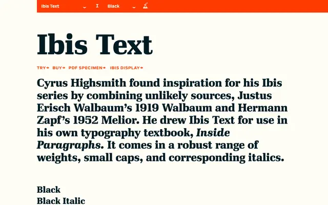
A text serif drawn by Cyrus Highsmith for his own typography textbook, synthesising Walbaum's rationalism with Melior's rounded geometry across six weights with small caps and italics.
About
Designed originally for Highsmith's book Inside Paragraphs, Ibis Text takes two unlikely reference points, Walbaum's early nineteenth-century rationalist serif and Zapf's 1952 Melior, and fuses them into a highly legible text face. Six weights from Extra Light to Black each carry a corresponding italic and a full small caps set, covering a wide range of editorial and publishing applications. The extended Latin character set and ligature set make it well suited to book typography and long-form reading.
Classification
Ibis Text synthesises the sharp rationalism of Walbaum with the rounded, squared forms of Melior, producing a text serif with both classical structure and mid-century warmth. Its high contrast and bracketed serifs place it firmly in the transitional category.