Quiosco
Occupant Fonts · Cyrus Highsmith · 2007
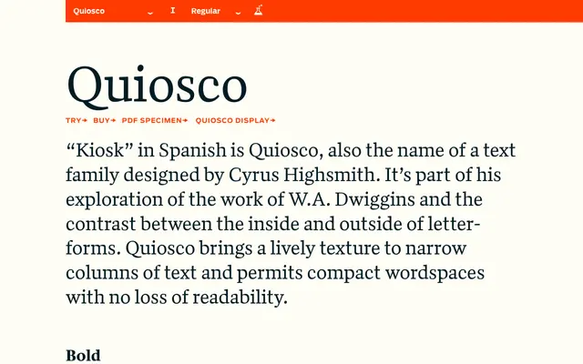
A text serif by Cyrus Highsmith rooted in W.A. Dwiggins's exploration of letterform contrast, optimised for narrow columns and compact wordspacing.
About
Designed in 2007, Quiosco takes its name from the Spanish word for kiosk and forms part of Highsmith's sustained study of W.A. Dwiggins and the tension between a letter's interior and exterior shapes. Three weights from Regular to Bold, each with an italic, give the family range for editorial hierarchies. Its lively texture holds readability in narrow measures where many text faces falter.
Classification
Quiosco draws on the tradition of W.A. Dwiggins, exploring contrast between the inside and outside of letterforms. Its lively texture and narrow-column suitability place it firmly in the humanist serif category.