Amster
Pampatype · Francisco Gálvez · 2014
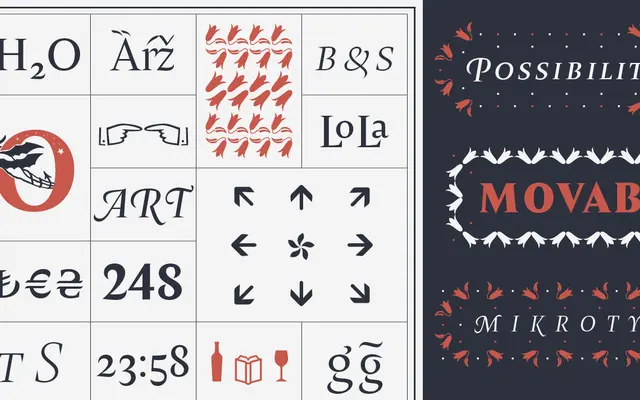
A Chilean-designed transitional serif by Francisco Gálvez, notable for its rich OpenType feature set including long and short swashes, programmed ornaments and multiple figure styles across five weights.
About
Designed in Chile by Francisco Gálvez and released in 2014, Amster brings together the clarity of transitional serif construction with expressive calligraphic energy. Ten styles span Thin to Black with matching italics, and the italic cuts carry long and short swashes alongside contextual alternates that give text a distinct personality at any size. Recognised as a Typographica Favourite and twice acknowledged at Tipos Latinos, it suits book work, magazines and editorial contexts where a serif needs both rigour and warmth.
Classification
Pampatype explicitly tags Amster as transitional and neoclassical, with glyphic and expressive qualities. The characteristics listed — swashes, long s, small caps, ornaments — confirm a classical serif tradition with display ambitions.