Rayuela
Pampatype · Alejandro Lo Celso · 2001
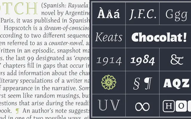
An informal multi-style serif by Alejandro Lo Celso, developed through postgraduate study at Reading and the ANRT, designed to bring warmth and character to long-form reading.
About
Developed during Alejandro Lo Celso's MA at the University of Reading and his studies at the ANRT in Nancy, Rayuela was the first typeface published by Pampatype and remains one of its most recognised releases. The text family runs across three weights — Blanca, Gris and Negra — each with an italic, all carrying an informal, handcrafted quality that is uncommon in types intended for extended reading. OpenType features include small caps, old-style figures, contextual alternates and discretionary ligatures, making it well suited to literary and editorial work where typographic personality is valued.
Classification
Rayuela is a serif typeface with an informal, handcrafted spirit designed for long-text readability, placing it in an informal or lyrical serif subcategory rather than a conventional transitional or humanist classification.