Armin Grotesk
W Type Foundry · David Súid · 2018
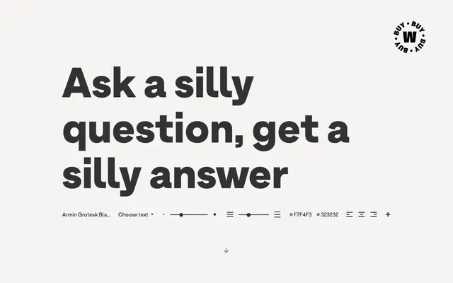
A 14-style neo-grotesque by David Súid, designed as a tribute to Swiss graphic designer Armin Hofmann with stylistic alternates for added flexibility.
About
Designed in 2018 as a homage to Armin Hofmann and the Swiss Style, this neo-grotesque runs across seven weights from Thin to Black, each with a matching italic. Stylistic sets applied to a broad set of letters including G, R, a, g, h, l, m, n, r, t, u and y allow the typeface to shift character and adapt to different visual languages. The family also includes Armin Soft, a companion with rounded terminals.
Classification
Designed as an homage to Swiss Style neo-grotesque typography, Armin Grotesk follows the clean, neutral conventions of the neo-grotesque tradition with stylistic alternates that allow for more eclectic expression.