Dorival UI Narrow
Blackletra · Daniel Sabino, Lucas Gini · 2024
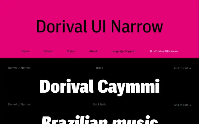
A narrow-width geometric sans with multiplexed spacing, designed for digital interfaces where text reflow across weight changes must be avoided.
About
Loosely derived from DIN 1451, this narrow cut of the Dorival UI family pairs an engineered geometric structure with diagonal terminals and a degree of stroke contrast. Its defining technical feature is multiplexed spacing: every weight shares identical glyph widths and kerning, so swapping weights never causes text reflow in layouts. The narrow width sits alongside condensed and standard cuts, making the broader family practical for both screen interfaces and print.
Classification
Loosely derived from the engineered geometry of DIN 1451, with subtle humanistic traits such as diagonal terminals and slight stroke contrast, placing it firmly in the geometric sans-serif category.