Anto Plot
b•v-h type · André Baldinger & Toan Vu-Huu · 2017
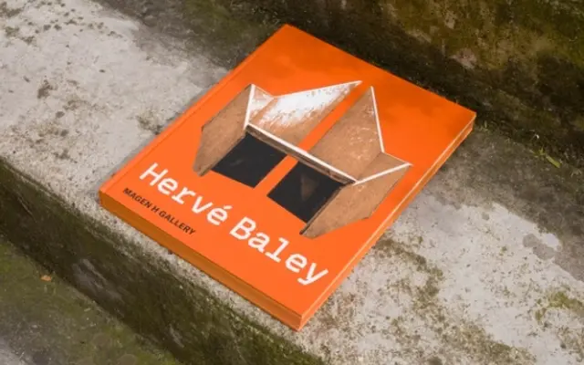
An angular geometric sans with roots in early grotesque proportions, designed by André Baldinger and Toan Vu-Huu for contemporary art institutional identities.
About
First sketched in 2017 for the visual identity of Bétonsalon contemporary art centre in Paris, Anto Plot takes its proportional cues from the Monotype Grotesque Bold Extended, translating those references into deliberately hard-edged, geometric letterforms. The main family runs across four weights with matching italics, and extends into a monospaced variant and an experimental Lab sub-family. OpenType features cover small capitals, old-style figures, framed and circled number sets, and a suite of alternate glyphs, across 825 glyphs per roman style.
Classification
Described by the foundry as voluntarily angular geometric, inspired by early sans-serif designs like the Monotype Grotesque Bold Extended. The letterforms are built on a geometric skeleton with hard angles rather than rounded terminals.