Bart Display
b•v-h type · André Baldinger & Toan Vu-Huu · 2022
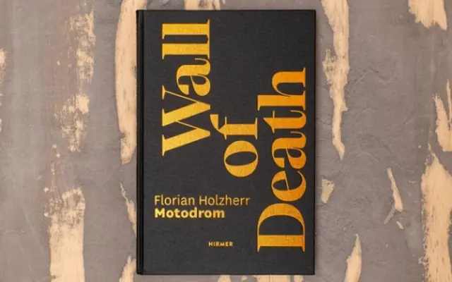
A high-contrast serif family designed originally for the Opera of Strasbourg, blending Oldstyle, Transitional and Neoclassical influences across three optical variants.
About
Conceived in 2019 for a pitch to the Opera de Strasbourg and released in 2022, Bart Display is the highest-contrast of three optical subfamilies, each offered in four weights from Regular to Heavy with matching italics. Distinguishing details include square dots, wire elements, right-angled terminal cuts and wheelbase angles that push the design toward a contemporary aesthetic without abandoning classical structure. An extensive set of OpenType features covers alternate glyphs, multiple figure styles, circled and framed numbers, and broad Latin language support across hundreds of scripts.
Classification
The foundry describes the design as combining Oldstyle, Transitional and Neoclassical elements with strong stroke contrast and delicate right-angled cuts, placing it firmly in the neoclassical serif tradition. The Display subfamily is the highest-contrast optical variant of the three-contrast Bart family.