Diverse C
DDOTT · Dominik Thieme · 2022
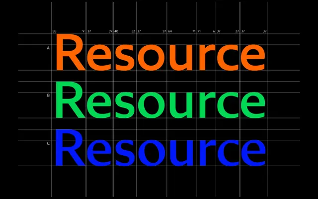
A high-contrast humanist sans by Dominik Thieme, the third member of a three-family system built on Gerrit Noordzij's pen-stroke contrast theory.
About
Diverse C applies the highest stroke contrast of the three Diverse families, all of which share a common skeleton rooted in early humanist designs like Johnston and Gill Sans. The contrast is shaped by broad-nib pen logic following Noordzij's model, and the family ships with 12 styles across six weights with true italics, plus over 33 OpenType features including small caps, sub- and superscripts, and geometric alternates. Optical corrections and shared spacing across all three contrast variants allow columns to be swapped between A, B and C without layout adjustment.
Classification
Diverse C is a humanist sans with high stroke contrast derived from broad-nib pen logic, grounded in Gerrit Noordzij's contrast model. Its skeleton draws from Johnston and Gill Sans, placing it firmly in the humanist sans tradition despite its calligraphic contrast levels.