Dita
Lettermin · Ermin Međedović · 2018
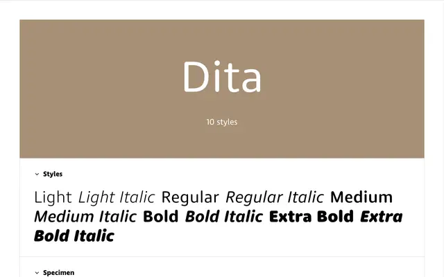
A rounded sans serif from Lettermin designed to hold up across both text and display settings, with consistent circular terminals maintained across five weights.
About
Designed by Ermin Međedović and published in 2018, this family extends to 30 fonts across three widths: standard, condensed and wide. The weight range is deliberately constrained from Light to Extra Bold, a decision driven by the difficulty of drawing rounded terminals at extreme stroke thicknesses. A generous x-height and spacious counters support readability at small sizes, and the family serves as the UI typeface for the Lettermin website itself. Each font includes five numeral variants, small caps and a set of stylistic alternates.
Classification
A low-contrast sans serif with rounded stroke terminals throughout, designed to function at both display and text sizes. Its construction follows conventional grotesque principles but is distinguished by consistent rounded endings across all weights.